Vodafone & Ziggo app is a unified digital
platform helping customers manage connectivity,
billing, and support in one place through
information and self-service.
platform helping customers manage connectivity,
billing, and support in one place through
information and self-service.
Project OneApp.
Combine the existing My Ziggo &
My Vodafone app into a single app.
Combine the existing My Ziggo &
My Vodafone app into a single app.
Project
Timeline:
2 years
Client:
VodafoneZiggo
Type:
In-house designer
Team
+
3 UX Designers
+
1 Visual Designer
+
1 UX Researcher
+
6 Developers
+
2 Product owners
Role
UX Designer
Helped shape early product direction with engagement prototypes rooted in behavioral insights and proven mental models.
Designed core experiences like Discover and the combined invoices overview,translating research and constraints into reusable patterns.
Improved scalability by defining flexible UI patterns and proposing a multi-brand design system that reduced maintenance and accelerated development.
During my early years at VodafoneZiggo,
I contributed to a UX-led initiative to combine
the My Vodafone & My Ziggo apps through design
sprints, early wireframes & UI, and prototypes that
supported engagement and decision-making.
I contributed to a UX-led initiative to combine
the My Vodafone & My Ziggo apps through design
sprints, early wireframes & UI, and prototypes that
supported engagement and decision-making.
Early prototyping
Ziggo stories
Both My Apps (especially My Ziggo) suffered from low recurring engagement, with users mainly returning to view their monthly invoice. Drawing on insights from My Unboxing research, I was asked to explore features that could drive engagement beyond this functional moment. I first explored interactive stories, then evolved the idea into a monthly Ziggo Wrapped inspired by Spotify Wrapped. Both concepts leveraged familiar mental models like Instagram Stories and Spotify Wrapped, supported by the principles of reciprocity and commitment. The goal was to stimulate repeat engagement while creating a natural upsell opportunity when users perceived clear short-term value.
Early prototyping
Ziggo wrapped
Both My Apps (especially My Ziggo) suffered from low recurring engagement, with users mainly returning to view their monthly invoice. Drawing on insights from My Unboxing research, I was asked to explore features that could drive engagement beyond this functional moment. I first explored interactive stories, then evolved the idea into a monthly Ziggo Wrapped inspired by Spotify Wrapped. Both concepts leveraged familiar mental models like Instagram Stories and Spotify Wrapped, supported by the principles of reciprocity and commitment. The goal was to stimulate repeat engagement while creating a natural upsell opportunity when users perceived clear short-term value.
Design sprint: onboarding
Onboarding via stories
After approval, the UX research team ran four design sprints to shape the new app. I joined as a designer and subject-matter expert, contributing to the Onboarding and Discover sprints based on my early prototypes. We chose interactive stories for onboarding to better explain the value of the new app, especially given the complex question of why users needed to download a new app even if they only had Ziggo. Building on positive feedback, the Discover sprint introduced a monthly unboxable reward, letting users choose gifts and reinforcing commitment and reciprocity. User testing validated the concepts, leading me to further develop and refine the Discover experience in later project phases.
Prototyping
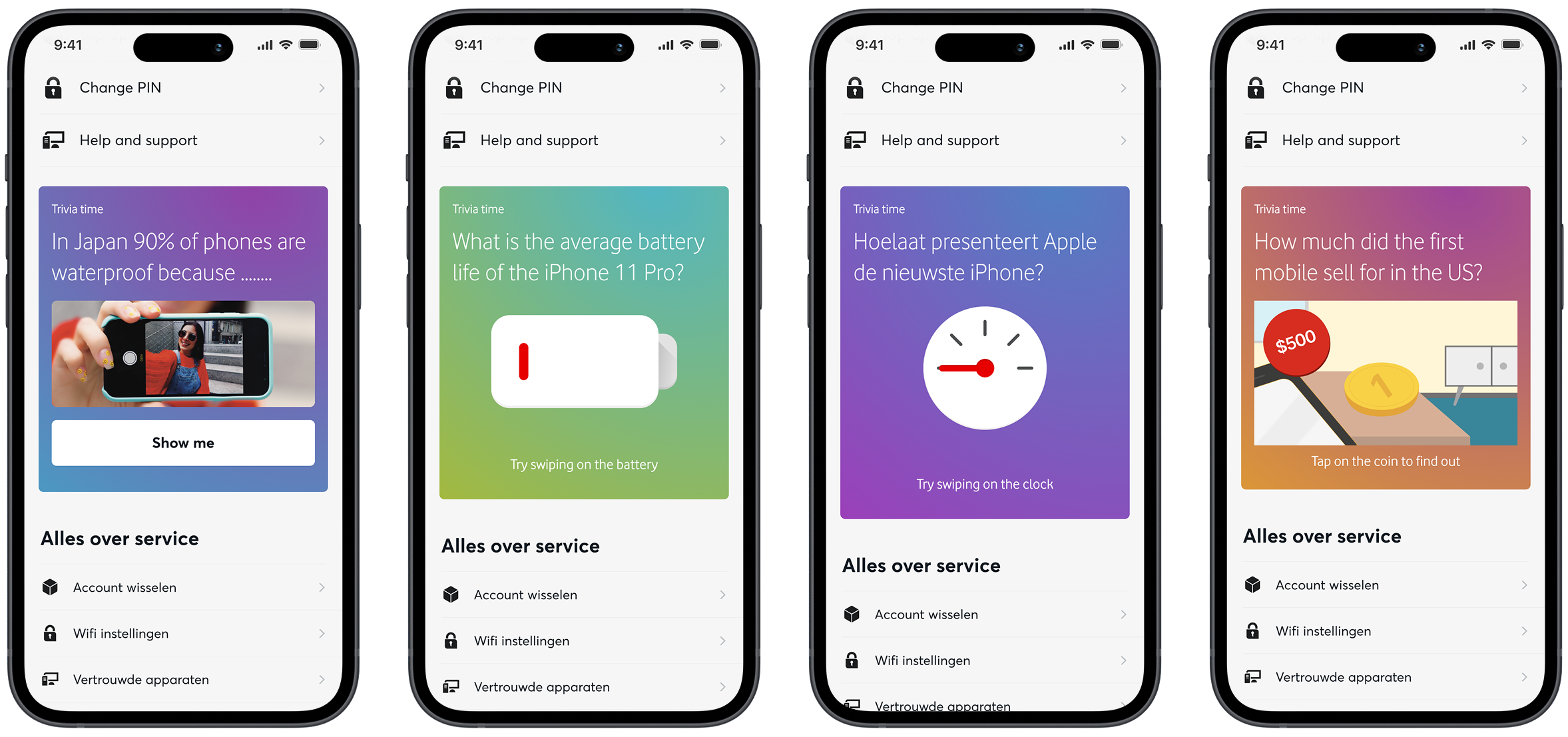
Discover component
Because of low engagement in the legacy apps and strong sprint feedback, Discover became the flagship section of the combined app. I was also asked to explore how it could guide users from the dashboard to service content or relevant purchase and upsell flows. Based on My Unboxing research, I found that improving users’ understanding of their products increases confidence and engagement, even though this curiosity is rarely deliberate. To address this, I designed a lightweight trivia component that could be skipped or casually explored, offering small learning moments that encouraged deeper feature or offer discovery. I later refined the concept with multiple interaction patterns, such as swiping and tapping, to reduce repetition and align with the design system.
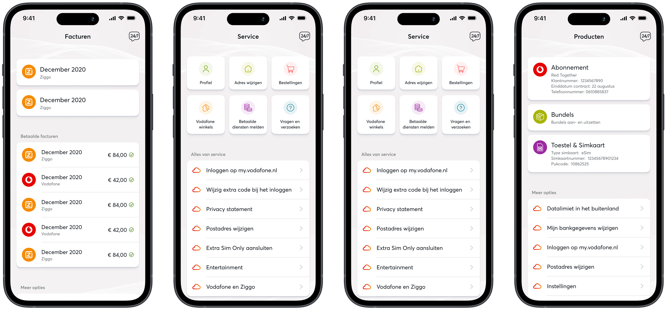
Wireframing & List component
Invoices overview
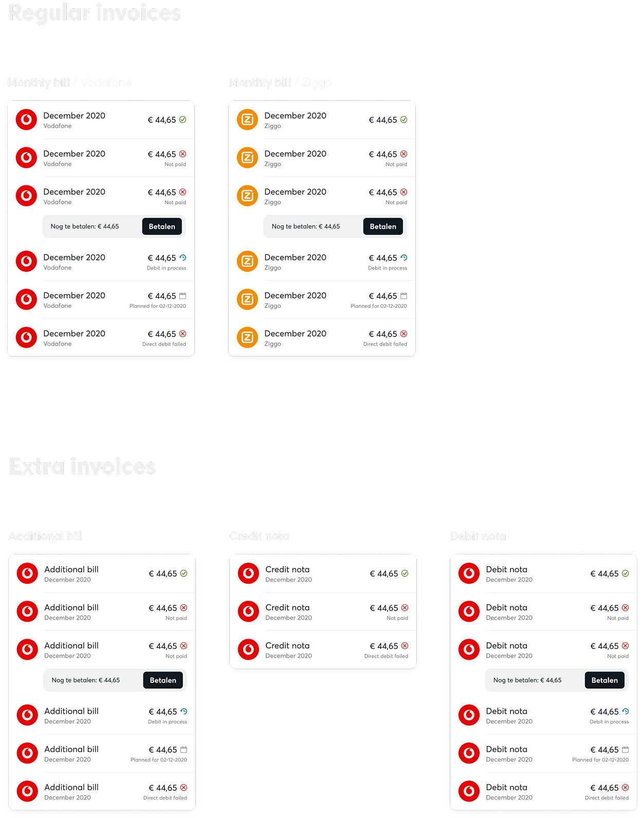
Checking monthly invoices was the core use case for both apps, particularly for business users managing multiple invoices. Becaus e Vodafone and Ziggo used different invoice systems with varying types and states, I was tasked with designing a single, clear invoice overview for the combined app.
Through stakeholder sessions and internal interviews, I mapped all invoice types and states and explored whether they should be separated or combined. After several iterations, we aligned and merged them into one overview to reduce complexity and prevent missed payments, while carefully avoiding visual overload from multiple brand colors and status indicators.
As the work progressed, I realized the invoices page was part of a broader pattern: much of the app relied on list-based components. I shifted focus to designing a flexible, reusable list component that could support invoices, products, and services, improving consistency and saving development time. Although this approach was initially difficult to communicate, post-launch feedback confirmed it laid a foundation that is still being used and built upon today.
Wireframing & UI Design
Design iterations
Throughout the project, I contributed to defining the app’s visual style and UI, focusing on a minimal set of highly flexible components (such as lists and cards with variable properties) to support rapid front-end development within tight time constraints.